> ## Documentation Index
> Fetch the complete documentation index at: https://www.referly.so/docs/llms.txt
> Use this file to discover all available pages before exploring further.
# Pop-up settings
> Design a Referly announcement pop-up: choose a style variant and position, add an image or icon, write the title and message, set the call-to-action button, and add a countdown timer.
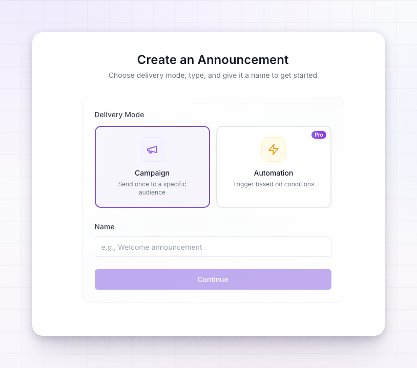
Every Referly announcement is a **pop-up** — a card that opens over the affiliate's dashboard inside the [affiliate portal](/docs/help-center/affiliates/portal-overview). This page walks through the options on the **Design & Content** tab of the editor, where you shape how that pop-up looks and what it says.
A live preview sits next to the editor the whole time, so every change you make shows up straight away.
The pop-up is the only announcement format available today, so there's no format to choose — open a new announcement and you're designing a pop-up.
## Choose a style and position
Under **Style**, pick a **Style Variant** — each is a ready-made layout:
* **Style 1** — a classic centred card, with the option to add more than one step.
* **Style 2** — a panel that slides in from the side, with the content stacked.
* **Style 3** — a minimal card built around an icon and a single action.
Then set the **Position** on the screen: centre, or tucked into a corner. Some layouts are designed to sit in a corner rather than the middle, so the available positions change with the style you pick.
## Add a header image or icon
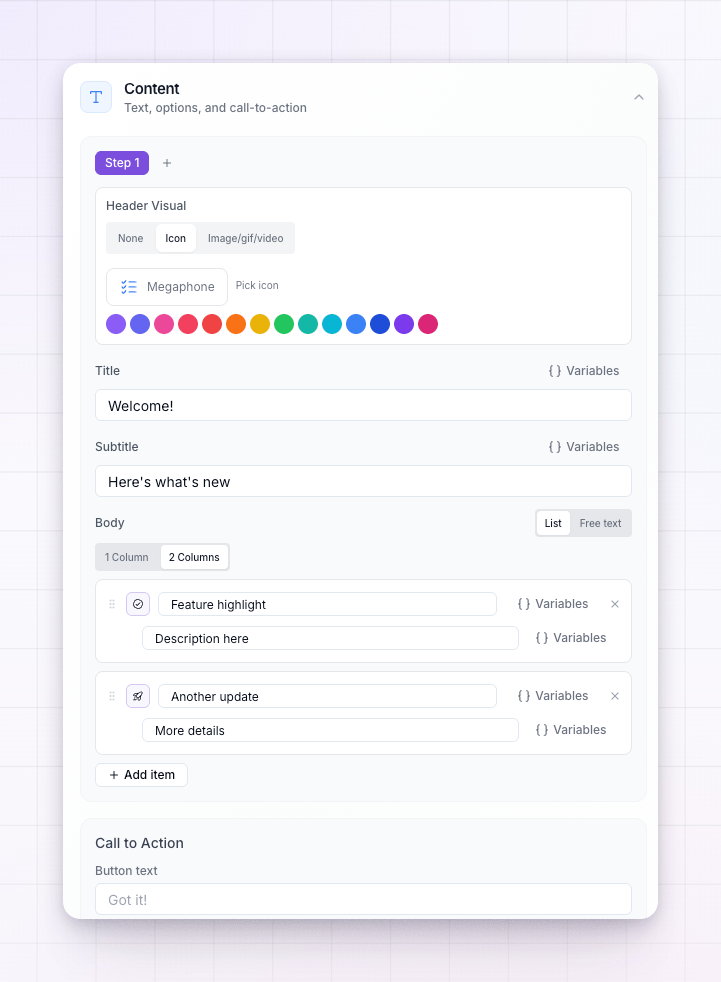
Depending on the layout, a pop-up can lead with a small **icon** or a larger **image, GIF, or video** at the top. Choose an icon from the built-in set, upload your own image, GIF or video, or paste a YouTube link. Keep visuals light so the portal still loads quickly — uploads for affiliate announcements need to be under 5MB.
## Write the title and message
Add a **Title**, an optional **Subtitle** (on the layouts that support one), and the **Body** text of your message. Write the body the way you'd talk to your affiliates — short and clear beats long and formal.
## Walk through more than one step
Style 1 and Style 2 let you add extra steps, so you can take affiliates through a short sequence — for example an intro, then the offer — inside a single pop-up. Use **Add step** to create the next one, and switch between steps to edit each in turn.
## Set the call-to-action button
The **Call to Action** controls the button at the bottom of the pop-up:
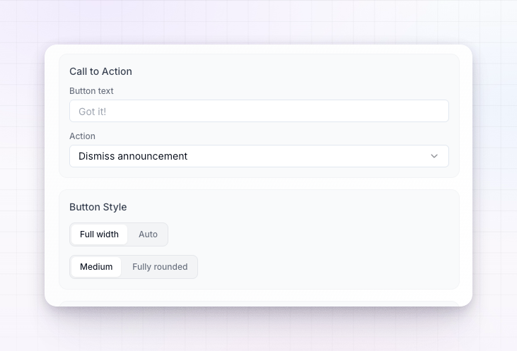
* **Button text** — what the button says, such as `Got it!` or `Claim offer`.
* **Action** — what happens when it's clicked. Choose **Dismiss announcement** to simply close the pop-up, or **Open URL** to send the affiliate somewhere.
* **URL** — the link to open, shown when you pick **Open URL**. Turn on **Open in new tab** to keep the portal open behind it.
You can also fine-tune the button's **width**, **alignment**, and **shape** under **Button Style**.
## Add a countdown timer
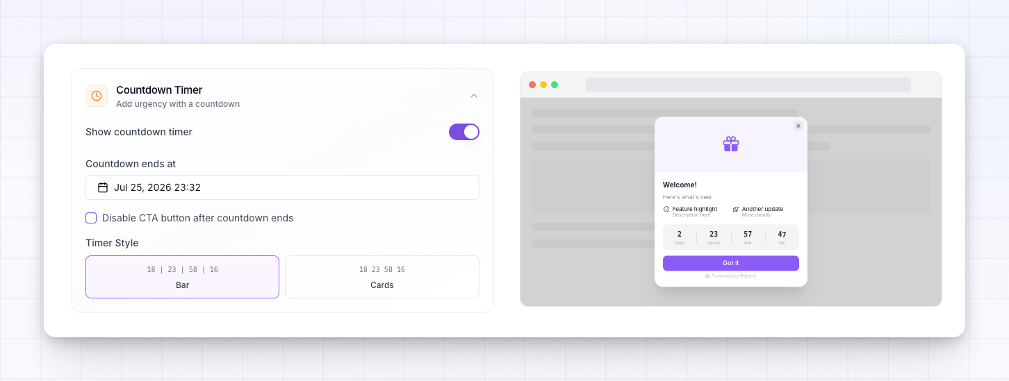
Turn on the **Countdown Timer** to add urgency to a limited-time offer. Set when the countdown **ends**, choose a **Bar** or **Cards** style, and optionally **disable the button after the countdown ends** so the offer closes itself when time runs out.
## Hide Referly branding
By default announcements carry a small "Powered by Referly" badge. Turn on **Hide Referly Branding** to remove it for a fully white-labelled look. This option may depend on your plan.
## Preview before you send
Use the preview beside the editor to check how the pop-up looks before publishing. When you're happy with the design, move on to the **Setup** tab to decide [who sees it](/docs/help-center/engage/announcements/audience) and when.
## Related
How announcements work and where they appear.
Send an announcement to everyone or a filtered group.
Link a pop-up straight to the banners and links affiliates promote with.
Have two-way conversations with your affiliates instead.